A marker of current trends, an aesthetic detail, a touch of customisation: in architecture colour can be all of this and much, much more. Evidence can be seen in more than 40 international studies that have demonstrated how colour plays a fundamental role in our mental and physical well-being. Simple colour choices are capable of completely changing our perception of space and the way we experience it.
Each colour palettes stimolate our mind with different information. Colour catches our eye ahead of shape and movement, providing key information about an image. This process is faster than the blink of an eye, and has developed over millennia of human evolution and complex associations assimilated by our brain.
Red helps us to excel in competitive contexts, blue and green support reasoning and problem solving, yellow is very useful to increase energy and focus, brown is associated with accuracy and reliability and black is unbeatable in the context of elegance and seduction.
Simple examples demonstrate how, even in the world of design, colour represents a core consideration in any project. From a building’s structure to the furnishings, different colour palettes stimulate our mind with different information to allow increased concentration, help us to relax or improve our performance at work.
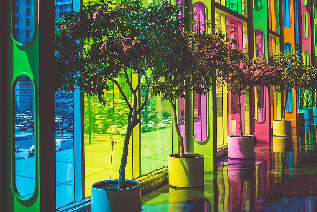
It is no surprise that simple distinction between spaces for work and relaxation or between artificial and natural environments, is communicated to us on a day-to-day basis primarily via the colours of the surrounding environment. Fixed colour groups are instinctively associated by our brains with artificial elements, while polychromatic environments, belonging to the group of dynamic connections, are associated with nature and changes with passing time.
This distinction also applies for background colours (muted, darker tones) and foreground colours (bright and lively) that can be combined in different ways to completely alter our perception of space. An area with walls painted with background colours gives us the sensation of a more spacious environment than it really is, while foreground colours, warm and bright, trigger a sense of closeness and stimulation.
Meanwhile, monochrome spaces can have a negative effect on our minds, requiring significant visual effort with consequent psychological oppression for users. On the other hand, even a touch of colour, provided by a series of colourful seats, for example, promotes a notable improvement in the comfort of an environment, mitigating visual fatigue and creating a sense of order and harmony that has a positive influence on a person’s mental and physical well-being.
When colour saves lives: the case study of the japanese underground
Between 2000 and 2010, a group of Japanese academics decided to investigate the correlation between colours and suicide, using an experiment conducted in 71 stations around the city’s underground transport network, 11 of which were equipped with blue LEDs.
The data collected demonstrate how, comparing the 11 stations with these LED lights and the 60 stations without them, the number of suicides in the first group was as much as 84% lower. This figure confirms that a shade of light or colour can have decisive impacts and even save lives.
Coloured pergolas for a guaranteed good mood
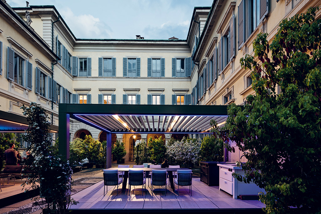
In the open-air world too, the colour of a pergola can make all the difference by triggering the mood shift required to switch easily from the world of work to your leisure time.
The use of colours that differ from those of the surrounding buildings allows the outdoor structure to stand in contrast with the working environment and therefore be perceived as a place for enjoyment and relaxation. Instead, if you wish to create a transition, it is better to use a foreground colour paired with that of the main building, thus creating a positve boundary between spaces, passing from the cooler working environment to warmer areas designed for leisure.
Lively colours. Pratic studies the effects of colour in the world of design
In 2019, Pratic decided to take a closer look at how colour influences architecture, lifestyles and individual well-being, launching a neuroscience research project in collaboration with the IULM University of Milan and the University of Modena and Reggio Emilia.
A group of academics collected over 40 of the most recent international studies in this area, identifying genuinely surprising results that not only outline the elements required for effective indoor and outdoor architectural design, but also shine a light on the cognitive processes underlying our perception of colour and their effect on different aspects of our daily lives.
According to Lively Colours, the study launched by the open-air-culture company, the value that we unconsciously attribute to different colours is founded in instinctive reactions of our body linked above all to the evolutionary experience of human beings and the significance that the latter has attributed to colours over millennia. For example, warmer and lighter colours increase muscular tension, accelerate heart rate and breathing, supporting movement, while darker and cooler colours provoke the opposite effect, generating a sense of calm and self-satisfaction.
This mixture of factors today leads us to consider colour as an element with a concrete impact on mood and psychological well-being, to the point where its beneficial applications can be found in the broadest range of contexts, from architecture to marketing, and even medicine. All of the details regarding the Lively Colours research are available here.